Stay calm, create designs
 
 
NutriStyle

Mobile App Development
Design an iOS mobile app with a primary focus on improving a users grocery shopping experience with a bar scan feature that will allow users to compare products and nutrition analysis.
Role: Interaction Design, Visual Design
Tools: Pencil & Paper, Omnigraffle, Sketch, Keynote, InVision
Team: Sequoia Sims Project Manager, User Research, Info Architect

Overview

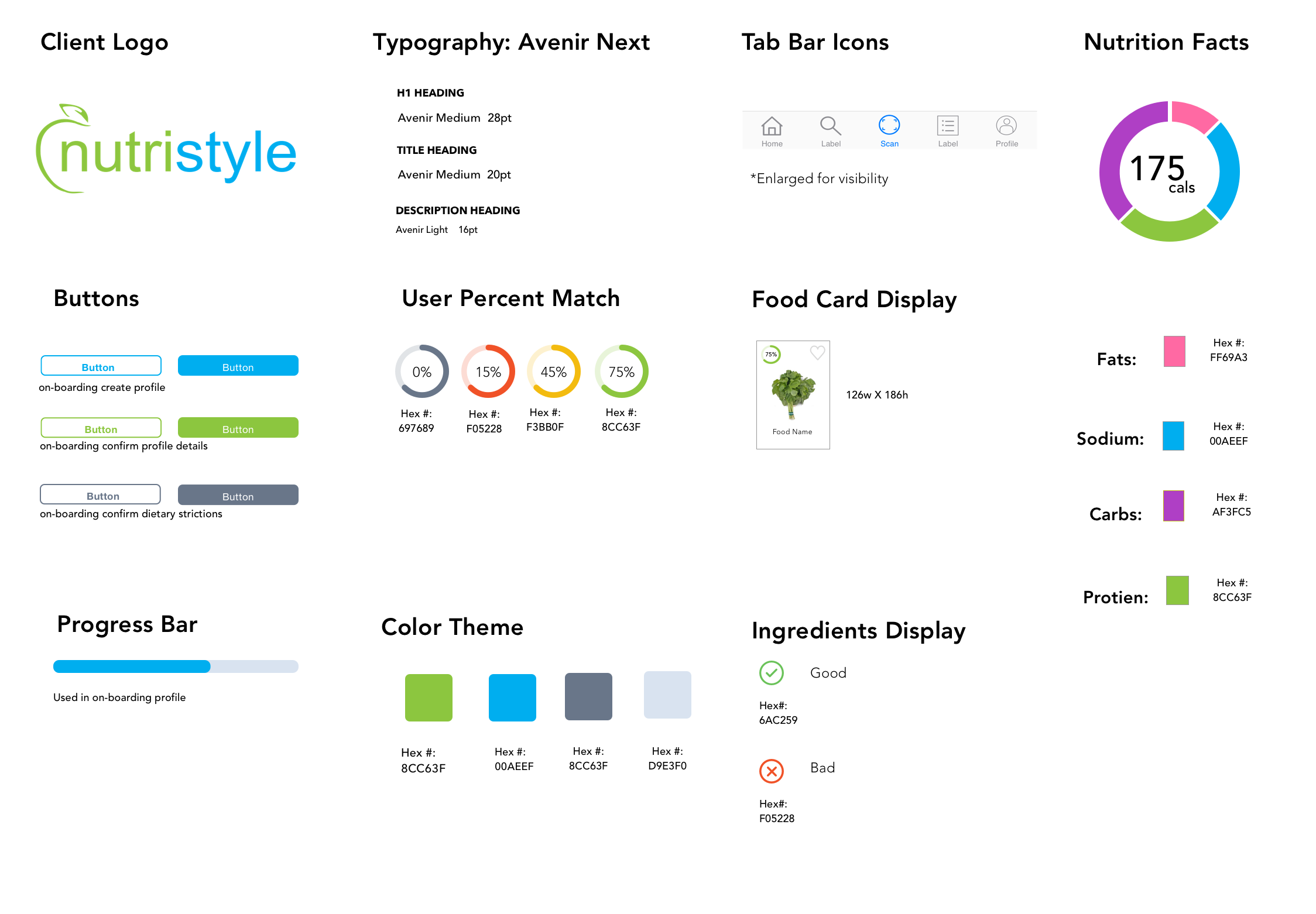
Partnered with our client to design an iOS mobile app that addressed users main pain points identified in our User Research that focuses on ‘User’s Grocery Shopping Experience. Mobile app includes a feature to allow users to scan products and compare nutritional facts and ingredients and achieve clients business goals by utilizing coupon ads for our users.


Discovery

Who is NutriStyle?

Seattle based company NutriStyle, Inc. is a technology company specializing in nutrition-based health and wellness software.

Their current website offers AI software that makes it easy for users to create menus for you and your family. It features the foods you like from the grocery store where you shop and it helps you track your health progress. Ultimate goal is to have these resources available, for free so users can focus on making healthier choices while they grocery shop.


Comparative Analysis

I conducted a comparative analysis on other apps to identified good design patterns and features similar to what NutriStyle wants and needs to improve users grocery shopping experience. iOS Apps: BuyCott, Pinto, ShopWell, and OptUp.


Define

Persona by User Searcher Sequoia

Persona Development

As Interaction Designer, the personas were crucial - as they are the basis for all features and research focuses. We needed to make sure our design suggestions were always appropriate to the personas’ unique needs and desires as health conscious users.

Researcher Sequoia conducted 4 target user interviews, and 62 participants complete a 23 question survey distributed over Slack, Craigslist, Nextdoor, Facebook.

This helped shaped our persona and focus on main pain points gathered.

  • Cost efficient, using coupons or awareness of discounts

  • Finding & searching healthy product alternatives

  • Adding recipe ideas to incentivize more home cooking

 
blue background.png
 

Design

Design Studio

As a Visual Designer, it’s important to have consistent check-in with our stakeholders to ensure our vision of the mobile app matches our stakeholder’s goals. Design Studio was a success and we identified Coupons as NutriStyle’s way of making money.

My Project Manager Sequoia decided to organize a Design Studio with our client NutriStyle to design the Product Scanned Results interface for our persona Catherine.


1. Show user a personalized percent match when they scan a product

2. Color wheel to seperate nutrition content easier to read for users

3. Prioritize content (Health Facts, Healthy Alternatives, Coupons, Images of Recipes)

Sketches

Sketching layouts allowed us to plan out the visual hierarchy of the content for the mobile screens.

It was important for me to come up with a strategic placement of coupons and discounts since this was a primary pain point for users. Our secondary objective was to allow users to Compare products and  get nutrient analysis on the product they scanned.


Progression of Iterations

I developed wireframes of the key pages on the site to test the initial impact of the content and to confirm that the main tasks Catherine needs to accomplish are easy and enjoyable.


How do we design to meet Catherines needs and NutriStyle’s needs?

How do we make money for NutriStyle?


blue background.png
 

Develop


Usability Testing

As an Interaction Designer, it was important for me to strategic placement of content to satisfy our stakeholder and persona’s needs.

There’s limited space on the mobile phone and there’s is a lot of information displayed after Catherine scans a product. I utilized interaction design so context can be easily refer to.

One of Nielsen’s heuristic principles suggest the designer should minimize the user’s memory load by making objects, actions, and options visible.

In my usability testing, users were able to access Nutrition Facts and Ingredients with a tap of a finger. Rather than push content down, users can refer back to nutrition or ingredient information with a tap of the finger.

1. Tap feature: users can view between Nutrtion and Ingredients

2. Swipe feature: users can swipe left to view next product


Tab Bar Iteration

 Using design elements that can relate to common human experiences and expectations. For example, users expect a “+” to be an expand or add feature. This is a reminder for me to follow real-world conventions and having a general understanding of how people process this interpret information.


1. V.1 Users expected icon to "add" function versus a "scan" function

2. User’s felt a “List” icon is more relatable to a grocery shopping than a "Heart"

3. Users thought "profile" icon looked too thick and was not iOS HIG compliant


Visual Design Testing

As a visual designer, I conducted heuristic evaluation to determine what was the best layout, color, and composition. This helped me identify usability problems in the user interface (UI) design.


1. Testing visuals for NutriStyle branding
Common color themes for fats, sodium, carbs, protien to make up Nutrtition color wheel


2. Testing visuals for Red-Green color deficient
Based on user's feedback, Design B. was preferred because even without red-green color, it was intuitive check means good, cross means bad


Delivery

Interaction Design

Visual Guideline


blue background.png
 

Outcomes


Results

The client have a better understanding on what users prioritize when they’re grocery shopping. They also realize how layout and gestures of accessing information for the user is important at the palm of their hands. They committed to continue developing the mobile app and incorporating their AI nutrition database into the mobile app and their website.

Next Steps

 Create user profile account that correlates with the on-boarding- for new users. Users thought the app needed an instructional to explain the percentage map and allow users to create a personalized diet plan. Develop on-boarding intro in mobile app was a need identified by User Researcher. I would also want to test and audit content from clients website and how it syncs with mobile and conduct more usability testings.

As for our Client’s goals, NutriStyle will work on partnerships with grocery stores as their revenue gains from the coupon feature in our mobile app.

What I Learned

Designing for many different users and I dived deep as Interaction Designer and Visual Designer with heuristic evaluation. This gave me insights to design elements based on what is universally expected or intuitive to the user.

Working with a client and treating them as your user as well as designing for the overall user. I learned to set expectations and my teammate and I were successfully delivered by clear lines of communication and following our SOW and focusing on the features that were agreed upon. There were a few times my teammate and I would drift off into other features that were all great ideas, but helping each other to refocus on our SOW.